Friday, July 18, 2014

How to Download Videos from Facebook using Google Chrome!

Wednesday, April 9, 2014

Wedding Text: Photoshop Tutorial

This is PHOTOSHOP TUTORIAL on TEXT EFFECT


Step One: Create a new document measuring 8x10" at
200 ppi, then open the middle east texture.jpg. This will
be used for the background. You can use any texture you
like, just make sure your text will be readable when it’s done.
Switch to the Move tool (V), hold the Shift key, and click-anddrag
this texture image into the main document that you just
created. The Shift key will center the texture.


Step Two: Press Command-R (PC: Ctrl-R) to make the rulers
visible in the document, then click on the vertical ruler and drag
out a guide to the 1.5" mark. If your rulers aren’t set to Inches,
Right-click on one of the rulers and select Inches. Place another
vertical guide 1.5" from the right edge, which will be at the 6.5"
mark. Now, click in the horizontal ruler at the top and drag
a guide down to about the 2" mark. This establishes the area
where the text will be placed in the composition.

Step Three: Press D to set your Foreground color to black,
and select the Type tool (T) in the Toolbox. Click on the upperleft
area where the guides intersect and drag out a text box to
where the guides intersect on the right, and then down toward
the bottom.


Step Four: Open the Character
panel (Window>Character),
and choose your font (we
chose the font Futura Book).
Make sure the text size is set
to around 35 pt to start and the
leading (space between lines)
is set to around 40 (the leading
f eld is to the right of the size
setting). Type in your quote.
As I mentioned, we’re using a famous quote from a classic movie:
The Princess Bride. You can see that the text looks pretty bland.
We need to do some formatting to spice it up.


Step Five: Select all the text by clicking inside the text box and
pressing Command-A (PC: Ctrl-A). In the Options Bar, click the
Center Text icon so each line of text is aligned to the center.

Step Six: Highlight just the f rst word, “Mawwiage.” Hold
down Shift-Option-Command (PC: Shift-Alt-Ctrl), and then
press the > key repeatedly to increase the text size in 5 pt
increments. Once some of the letters jump to the next line,
release only the Option (PC: Alt) key, and press the < key to lower the size in single-point increments until the word returns to one line.


Step Seven: We need to determine which words will be in the next line. We want the words “BWINGS US” on their own line, so select the words “IS WHAT.” Then, do the same thing as before: Use the keyboard shortcut to increase the text until it jumps to the next line, then back it off until it returns to one line. The second line will overlap the top line when you enlarge the text; we need to adjust the leading. With the second line still selected, hold down the Option (PC: Alt) key, and press the Down Arrow key on the keyboard continuously until the spacing is right. This setting can also be adjusted in the Character panel.

 Step Eight: Continue to do this to each line of text remaining in the quote. What you should have is the entire quote formatted in the def ned area with each line varying in size due to the different amounts of text. 


Step Nine: Let’s embellish the design with some swirly graphics. Here, we have a stock collection of swirly graphic elements we found on Fotolia.com. These are great because you have a variety of elements while only having to pay for one image. First, we need to extract them from the background. Open the Channels panel (Window>Channels), hold down the Command (PC: Ctrl)
key, then click on the RGB composite channel. This will load the
luminosity, in this case the white area, as an active selection.

Step Ten: We actually need the
black areas selected, so go to
Select>Inverse. Click the Create a
New Layer icon at the bottom of
the Layers panel to create a new
blank layer. Click the Eye icon next
to the Background layer to hide
it. Press D to set the Foreground
color to black, and then press
Option-Delete (PC: Alt-Backspace)
to put the black selection on a
transparent background.


Step Eleven: Even though we have all the elements extracted,
we only want to use part of the graphic that has the text in
it. You can always save this as a layered PSD f le and have the
graphics ready whenever you need them. First, use the Lasso
tool (L) to draw a selection around the graphic, and then using
the Move tool, hold the Shift key, and drag-and-drop it over in
the main working document


Step Twelve: Click the Eye icon next to the text layer in the Layers
panel to turn it off for the time being so you can see what
you’re doing. Press Command-T (PC: Ctrl-T) for Free Transform,
hold Shift-Option (PC: Shift-Alt), and click-and-drag one of
the corner points of the bounding box to scale the graphic to
the canvas. Press Enter to commit the transformation. Get the
Rectangular Marquee tool (M) and draw a selection over the left
end of the graphic where it extends beyond the guide. Then,
hold down the Shift key and add another selection to the other
side where it extends beyond the right guide. Press Delete (PC:
Backspace) to remove those areas. Press Command-D (PC: Ctrl-D)
to deselect.


Step Thirteen: Next, draw a selection over the rest of the
graphic except the swirly graphic and line at the top, then press
Delete (PC: Backspace) and deselect


Step Fourteen: Turn the text layer back on, and using the
Move tool, hold the Shift key and click-and-drag this graphic element
to the top of the text block. The Shift key will keep the layer
from shifting to the left or right. Make a duplicate of this layer
by pressing Command-J (PC: Ctrl-J). Go to Edit>Transform>Flip
Vertical, and then position this duplicated element at the bottom
of the text block.


Step Fifteen: Up to this point, the text and graphics have
been left black, but now we need to add a color. Click on the
Foreground color swatch near the bottom of the Toolbox to
open the Color Picker; set the RGB numbers to R:96, G:57, and
B:19; and click OK.


Step Sixteen: Make one of the graphic swirly layers active
and lock its transparency by clicking on the f rst icon to the
right of the word “Lock” near the top of the Layers panel.
Press Option-Delete (PC: Alt-Backspace) to f ll the object with
the new color. Do this to the other graphic swirly layer, as well
as the text layer (transparency will already be locked on the
text layer).


Step Seventeen: Make the top layer active in the Layers
panel, Shift-click the text layer to select all three layers, Rightclick
on one of the selected graphic layers, and choose Group
from Layers. When prompted, give the layer group a name,
and click OK.


Step Eighteen: Double-click to the right of the layer group’s
name to open the Blending Options in the Layer Style dialog. In
the General Blending section, set the Blend Mode drop-down
menu to Linear Burn. Then, go down to the Blend If section;
Option-click (PC: Alt-click) on the white slider under Underlying
Layer; and drag to the left to split the slider, allowing lighter
areas of the background texture to show through. This gives
the text a more aged look, yet it remains fully editable.


Thursday, April 11, 2013

Macro Photography: Reverse Ring Technique (Nikon)


In this tutorial I am going to show how to convert your ordinary kit lens into a macro lens using the reverse lens ring. This is one of the simplest and inexpensive way to shoot macro photography.


All you need is A reverse lens ring which cost about 9-10 dollars and double sided tape. The reverse ring size for Nikon is 52mm which perfectly match to the filter thread for the lens


First,

I recommend that you attach the reverse ring first before you are going to attach it to the DSLR body. Make sure that it is tight but not too much.


Second,

Now that the reverse ring was attached, you need to to remove the lens and put it in reverse. Be careful in doing this.


Third,

You need to make sure the aperture lever on the lens are open, if you don't know where is the lever, please refer to the pictures below, the red circles is the lever. There are many ways to make sure that the aperture remains open, one way is to put something sticky on it, like the double sided take. For me this is the simplest way to do it.


Fourth,

You are almost ready, If you encounter an error saying "Lens not attached" all you need to do is to change the dial to Manual Mode and that's it. You are good to goo.

Whenever you use flash and an error appear saying something like TTL...blah blah, all you nee do is change the setting of the flash to Manual.

Hope this helps.


Saturday, August 18, 2012

Vintage Sketch Effect

This is one of those effects that once you figure out how to create it, you end up using it in many different ways because it's so easy to change the images and text. By using smart objects in a very intelligent way, you can achieve really cool, easily updatable designs.
Photoshop Tutorial Vintage Effect
Final Result
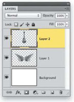
STEP TWO: Next, create a new document measuring 1O.5x7' at 100 ppi. Then, use the Move tool (V) to drag-and-drop the wing image into this new layout. Once there. Press Command-T (PC: Ctrl-T) to invoke Free Transform and scale the object disproportionately by squashing it horizontally. When done, press Enter. Press Shift-Command-U (PC: Shift-Ctrl-U) to remove the color in the image, then pres Command-I (PC: Ctrl-I) to invert the wings.
Photoshop Tutorial Vintage EffectPhotoshop Tutorial Vintage Effect


STEP THREE: Open the next image, which is a classic guitar. Some stock images like this come with a clipping path around the object, if not, don’t worry just use the same technique we just used to extract the wings. Again, press Shift-Command-U (PC: Shift-Ctrl-U) to remove the color and then drag it over to the working layout.
Photoshop Tutorial Vintage EffectPhotoshop Tutorial Vintage Effect


STEP FOUR: Once the guitar is in the layout, use Free Transform to scale (hold the Shift key to maintain proportions) and position it in the center of the graphic as you see here. Press Enter when done.
Photoshop Tutorial Vintage Effect

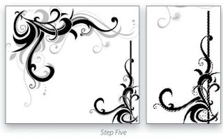
STEP FIVE: We have one more graphic element to add to the design. Open the swirly graphic image and use the Lasso tool (L) in the Toolbox to draw a loose selection around the smaller black swirly graphic at the bottom right. Then, switch to the Magic Wand tool and uncheck Contiguous in the Options Bar. Hold down the Option (PC: Alt) key and click on the white background inside the selected area. This will eliminate the remaining white background from the selection, leaving only the black graphic selected. Drag this to the working layout.
Photoshop Tutorial Vintage Effect

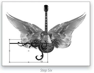
STEP SIX: Press Command-T (PC: Ctrl-T) to invoke Free Transform once again, and click-and-drag outside of the bounding box to rotate the object. Click-and-drag inside the box to position it at the lower-left side of the graphic, as shown here, and scale its size down a little. When done, press Enter.
Photoshop Tutorial Vintage Effect

STEP SEVEN: Press Command-J (PC: Ctrl-J) to make a duplicate of the swirly layer, and go to Edit>Transform>Flip Horizontal. Use the Move tool to drag this layer to the right until it mirrors the other side (hold the Shift key so it stays in line with the original swirly graphic). Once in place, press Command-E (PC: Ctrl-E) to merge the two swirly layers together.
Photoshop Tutorial Vintage Effect

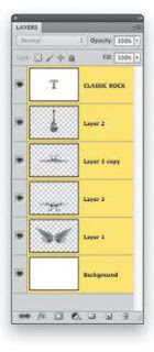
STEP EIGHT: Make a duplicate of this layer and then go to Edit>Transform>Flip Vertical. Move this element up until you have enough space between the swirly elements to place some text. Use Free Transform to make the top swirly graphic a little smaller than the one below. Switch to the Type tool (T) and press D to set your Foreground color to black. Type the words "CLASSIC ROCK" (we used Trajan Pro at around 68 pt) and position the type as you see here. Once everything is in place, drop the layer Opacity for both swirly layers to 50% and drag them in the Layers panel below the layer containing the guitar but above the layer containing the wings.
Photoshop Tutorial Vintage Effect

STEP NINE: Click on the top layer in the Layers panel, hold down the Shift key and click the Background layer at the bottom to select all the layers. Convert them into a smart object by Right-clicking on any layer and choosing Convert to Smart Object.
Photoshop Tutorial Vintage Effect

STEP TEN: Open a background texture file in which the finished design will be made. Drag the smart object layer to the texture layer. Hold down the Shift key as you drag to make sure it's dropped in the center. (The download texture file is the same size as the design file, so it should fit perfectly.)
Photoshop Tutorial Vintage Effect

STEP ELEVEN: Go to Filter>Stylize>Find Edges. This will change the design into a sketch outline. Filters applied to smart objects are considered smart liners, meaning they are nondestructive, allowing you to edit the original image within the smart object (more on that later).
Photoshop Tutorial Vintage Effect

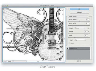
STEP TWELVE: Go under the Filter menu again to Artist>Rough Pastels. Every image will need different settings but the ones shown here is a good place to start. Just tweak the sliders until you have a nice grungy sketch effect. Click OK when done.
Photoshop Tutorial Vintage Effect

STEP THIRTEEN: You can see the result is pretty interesting but why stop here? Change the layer blend mode in the Layers panel to Color Burn. Make a duplicate of this smart object layer, and set this layer‘s blend mode to Soft Light. Turn off the filters on this duplicate layer by clicking on the Eye icon next to the Smart filters mask just below.
Photoshop Tutorial Vintage EffectPhotoshop Tutorial Vintage Effect


STEP FOURTEEN: Click on the Create New Adjustment Layer icon (halt-black, half-white circle) at the bottom of the Layers panel and choose Invert. This will apply an inversion to the entire image, but what we want here is to isolate it to the layer below it by using a dipping group. Do this by pressing Option-Command-G (PC: Alt-Ctrl—G).
Photoshop Tutorial Vintage Effect

STEP FIFTEEN: Now tor one final optional element: The background texture looks good but I think a nice gradient layer style could really add something to it. Click on the texture layer in the Layers panel to make it active, click the Add a Layer Style icon (fx at the bottom of the Layers panel, and choose Gradient Overlay. (Note: If your texture is on the Background layer, double-click it to make it a regular layer.) Use the settings shown here to get a nice high contrast vignette on the background completing the overall look.
Photoshop Tutorial Vintage Effect

 There you have it a seemingly complex look, yet it’s composed of smart objects, which contain all the original layers including the text layer. All we have to do is double-dick the smart object thumbnail in the Layers panel to open the original layered file. Once inside that smart object, you can change whatever you want, close and save the file, and it will update the image and re—render the filters automatically. It will even update all the duplicate smart objects as long as they're still linked to the original smart object.


Saturday, August 11, 2012

Increasing Contrast in the Iris

One of the secrets to really making eyes look captivating is to add contrast to the iris. It really brings out the color and depth of the eyes, without adding artificial color, and although it’s really easy to do, it delivers pretty amazing results.

Step One:
Here, our subject’s eyes look kind of flat, and almost hazy, because they’re really lacking contrast. So, to start off, we need to duplicate the Background layer by pressing Command-J (PC: Ctrl-J; or just drag the Background layer in the Layers panel onto the Create a New Layer icon at the bottom of the panel). Next, zoom in tight on the eyes. You’re going to be zooming in tight quite a bit when you’re retouching, so learning this quick way to zoom in can be a real timesaver: If you press-and-hold Command-Spacebar (PC: Ctrl-Spacebar), your cursor temporarily switches to the Zoom tool (the one that looks like a magnifying glass). Just click-and-drag this tool on the area you want to zoom in on (in this case, the eye on the right) and it zooms right into that spot. (Note: On a Mac, you’ll probably need to go to your Keyboard Shortcuts System Preferences and turn this system shortcut off first for it to work this way in Photoshop.)

Step Two:
Although there are a number of different ways to add contrast to a photo in Photoshop, this is probably the fastest and most efficient. At the top of the Layers panel, just change the blend mode of this duplicate layer from Normal to Soft Light (as shown here). This makes the entire image much more contrasty, but of course we don’t want all that—we just want her iris more contrasty. Don’t worry;we’re going to fix that in a moment.

Step Three:
Press-and-hold the Option (PC: Alt) key and click on the Add Layer Mask icon at the bottom of the Layers panel (it’s shown circled here in red). What this does is hides that really contrasty version of your image behind a black mask (so, it’s still there—you just can’t see it). The image now looks like it did when we first opened it (notice that her skin looks back to normal now?). Next, we’ll use the Brush tool to paint over the iris (and pupil) to reveal the supercontrasty version of it. So, start by getting the Brush tool from the Toolbox (you actually might as well get used to using the keyboard shortcut for the Brush tool— just press the B key).

Step Four:
Make sure that your Foreground color is set to white (since your layer mask is black, you’ll want to paint in the opposite color—white) and choose a small, softedged brush from the Brush Picker in the Options Bar. Begin painting over the iris and pupil, as shown here), and as you paint, the much more contrasty version of it is revealed, yet the rest of the photo remains untouched. If you make a mistake, just press the X key to switch your Foreground color to black, and paint over the area where you messed up to hide it again. When you’ve fixed your mistake, press X again to toggle the Foreground color back to white and continue painting over the iris (and pupil) to complete your contrast retouch.

TIP: Adding More Contrast
If, after painting in the iris, you think you need even more contrast, just duplicate the top layer. Since the eye is already masked, you’ll see just the iris and pupil become even more contrasty.

ANOTHER TIP: Using Curves
Instead of using a Soft Light layer to add more contrast to the iris, try an adjustment layer. Just click on the Create New Adjustment Layer icon at the bottom of the Layers panel and choose Curves from pop-up menu. Then, from the Curves popup menu at the top of the Adjustments panel, choose Strong Contrast (RGB). Press Command-I (PC: Ctrl-I) to Invert the layer mask and hide the contrasty version of your image behind a black mask. With your Foreground color set to white, get the Brush tool, choose a medium, soft-edged brush at 100% Opacity, and paint over the eyes to add lots of contrast (as seen here). Tweaking the contrast like this can tend to actually change the color of the eyes, so since we just want more contrast, change the layer’s blend mode from Normal to Luminosity, so you get the contrast, but not the color shift.